Hello!
I'm very busy at the moment preparing for Printsource New York which is in just a few weeks time. I'm proud to be showcasing lots of new work alongside four other members of the Finch & Foxglove collective; Adriana Bergstrom, Lisa Kirkbride, Courtney Beth Keller (aka One Little Printshop) and Adrienne Kerr on January 10th and 11th, 2017 Booth no. A19 at the Metropolitan Pavilion, New York. We'd love it if you came and said hi!
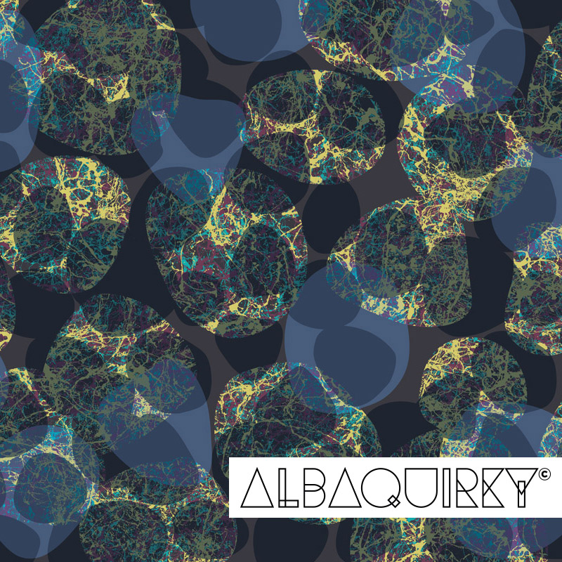
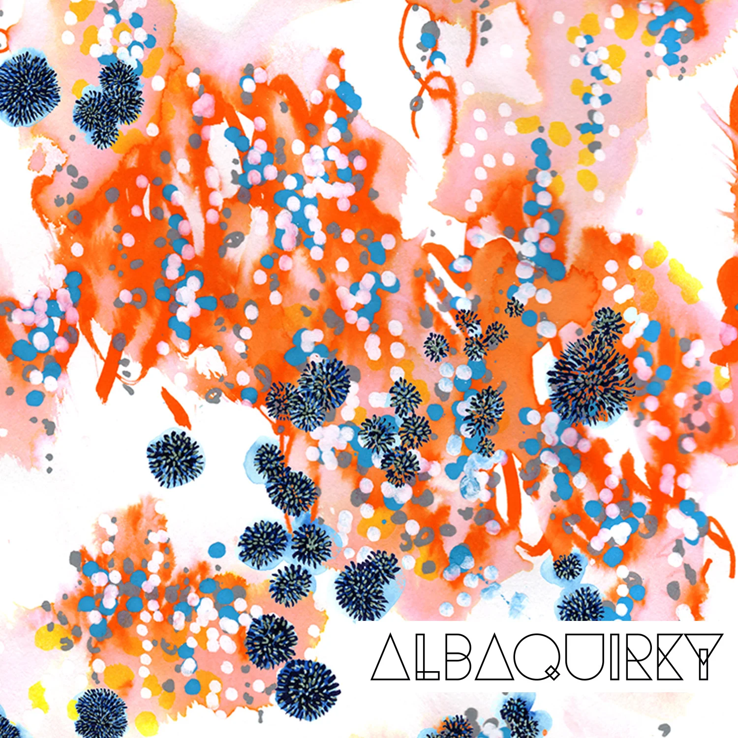
Part of preparing for the show is about getting your booth design right and there has been a lot of thinking going on behind the scenes for that. We agreed to have a mixture of big impact banners with full height designs and banners broken down into smaller panels of different examples of our trend aware work for a range of markets. I was lucky enough to have one of my designs included on a full height banner and wanted to talk you through the design process for that image in this blog.
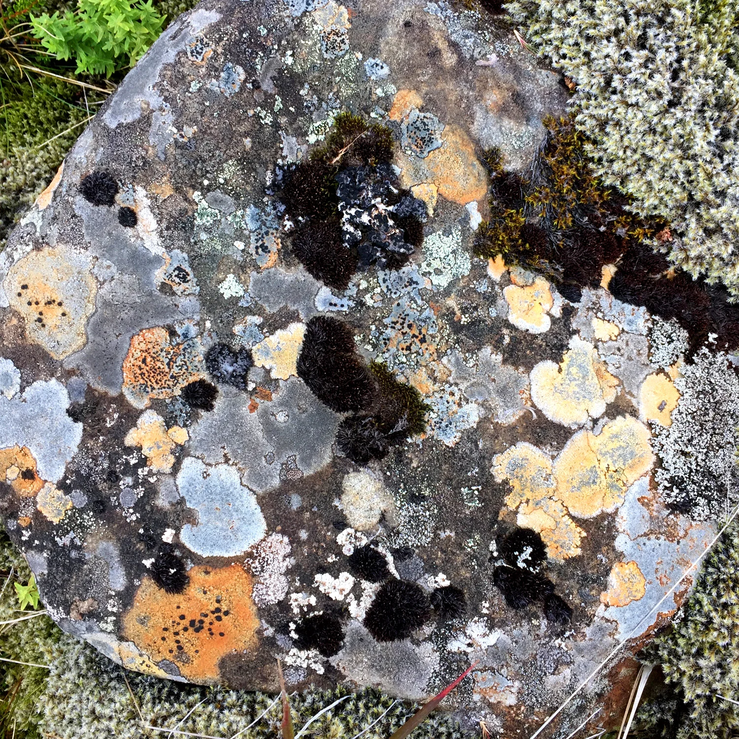
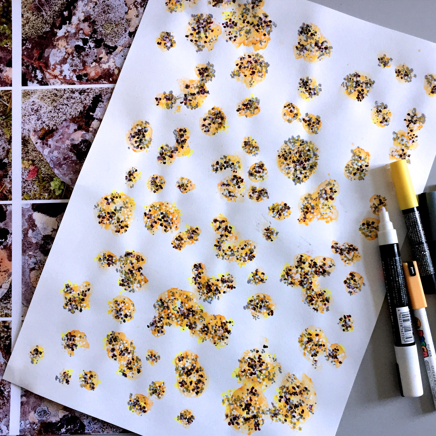
The final design sits in a much bigger collection of work inspired by my travels in Iceland mentioned in my last blog. I fell in love with the landscapes and textures while on a trip there. I came back with a lot of photos of rocks!
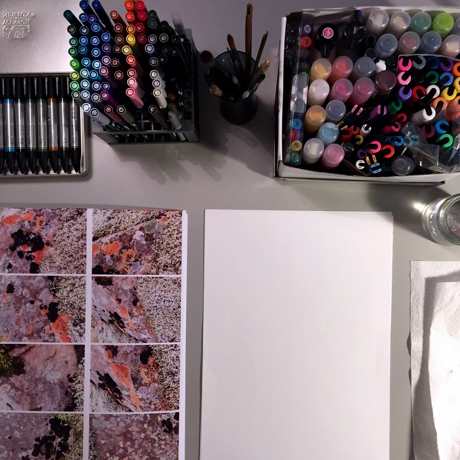
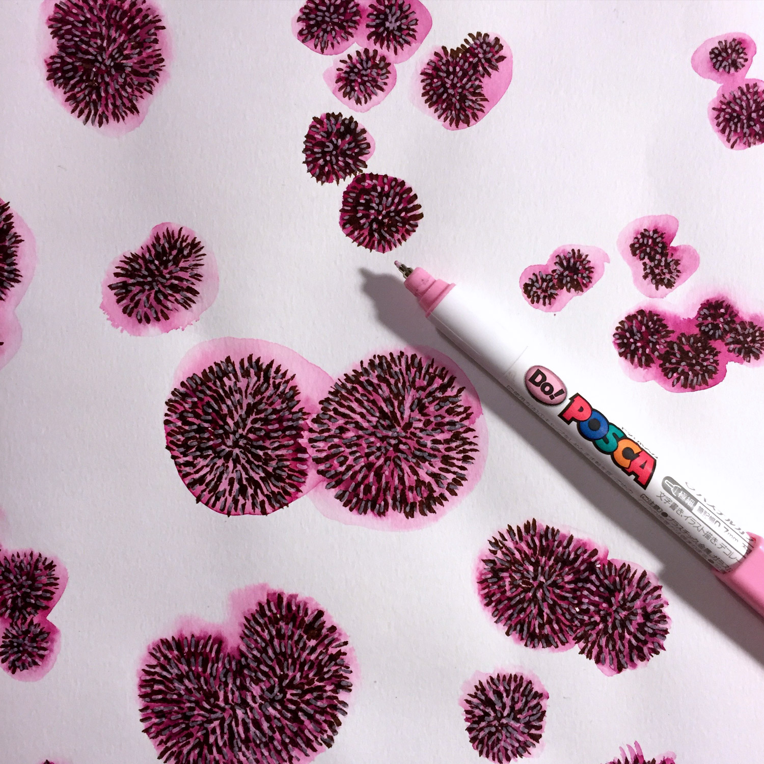
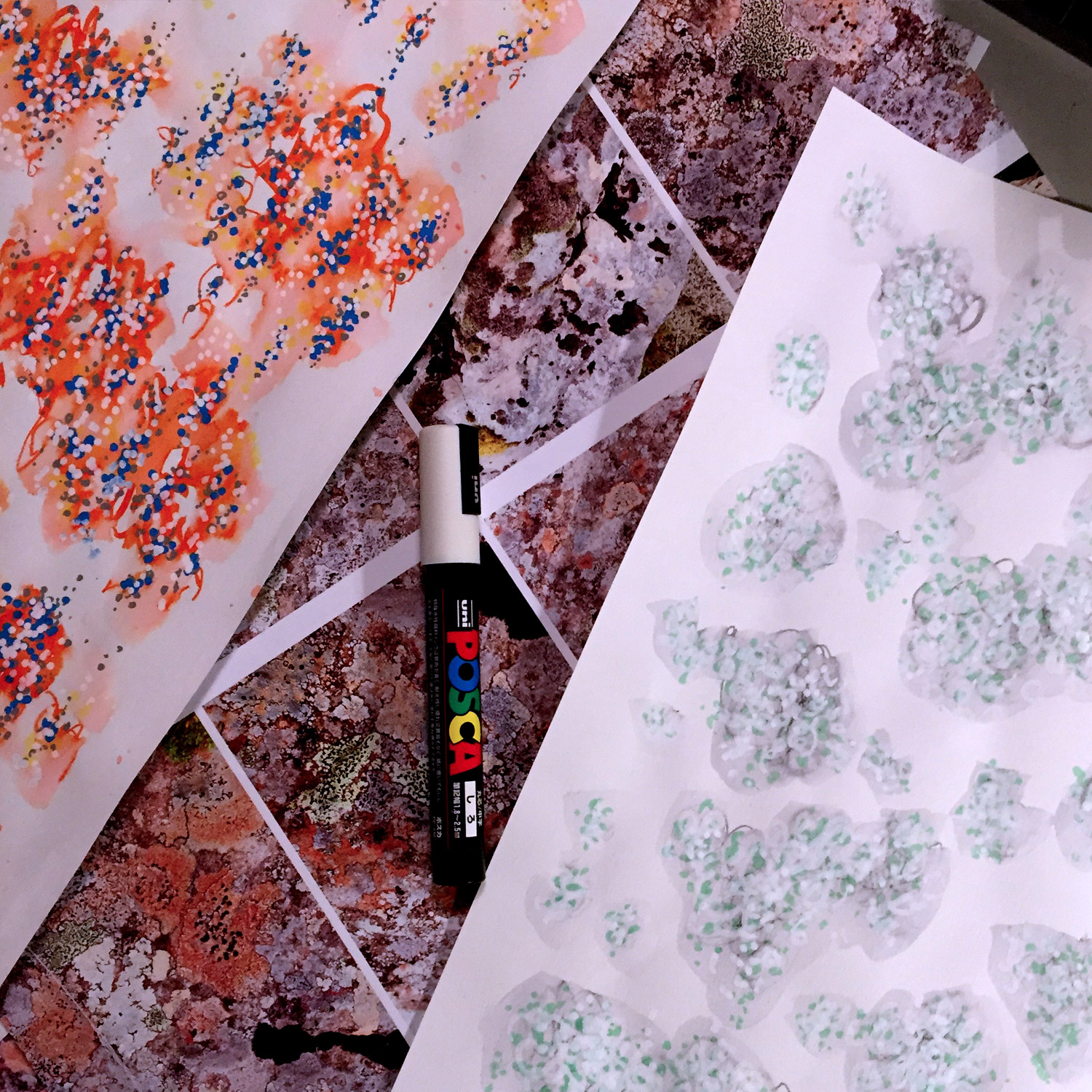
I have been enjoying mixing up media recently and like to get out all my materials when I start drawing. I am particularly keen on mixing wet media, like water colour pens and clean, more graphic, media like Posca pens.
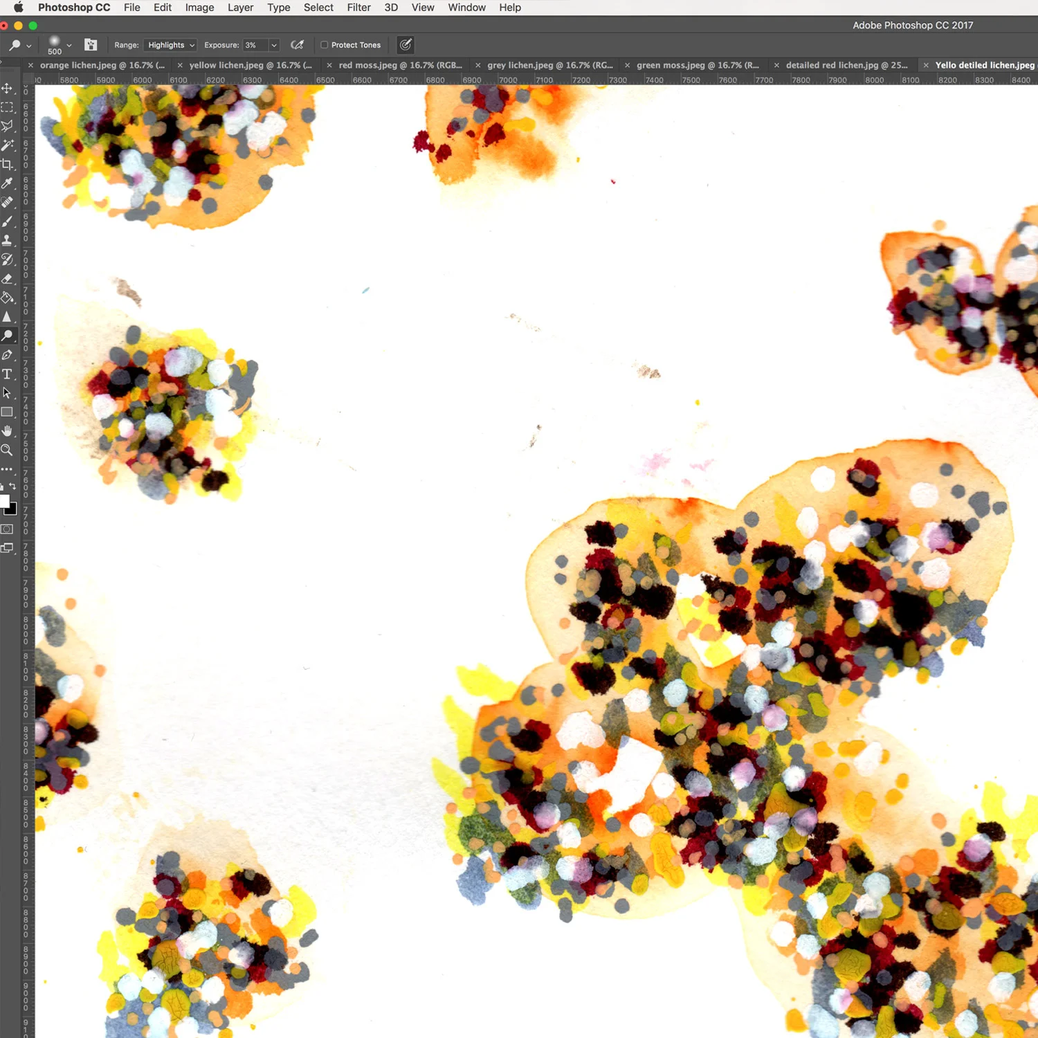
I draw with the digital process in mind, so build up many sheets of paper, that I anticipate will be layers in Photoshop. Sometimes I put down a layer as a wash, scanning it in and then working more on top with pen. I feel more freedom to be loose and experimental if I capture the stages that I like through scanning. By doing it this way I can always go back to an earlier stage. Interestingly I very rarely do, but there is obviously something psychological about having that option!
After scanning in I clean up the images and mask the elements. It is sometimes hard to decide how many accidental dots and marks to keep or to remove, I want to keep the energy of the handmade painterly process, so some dots stay and some marks go!
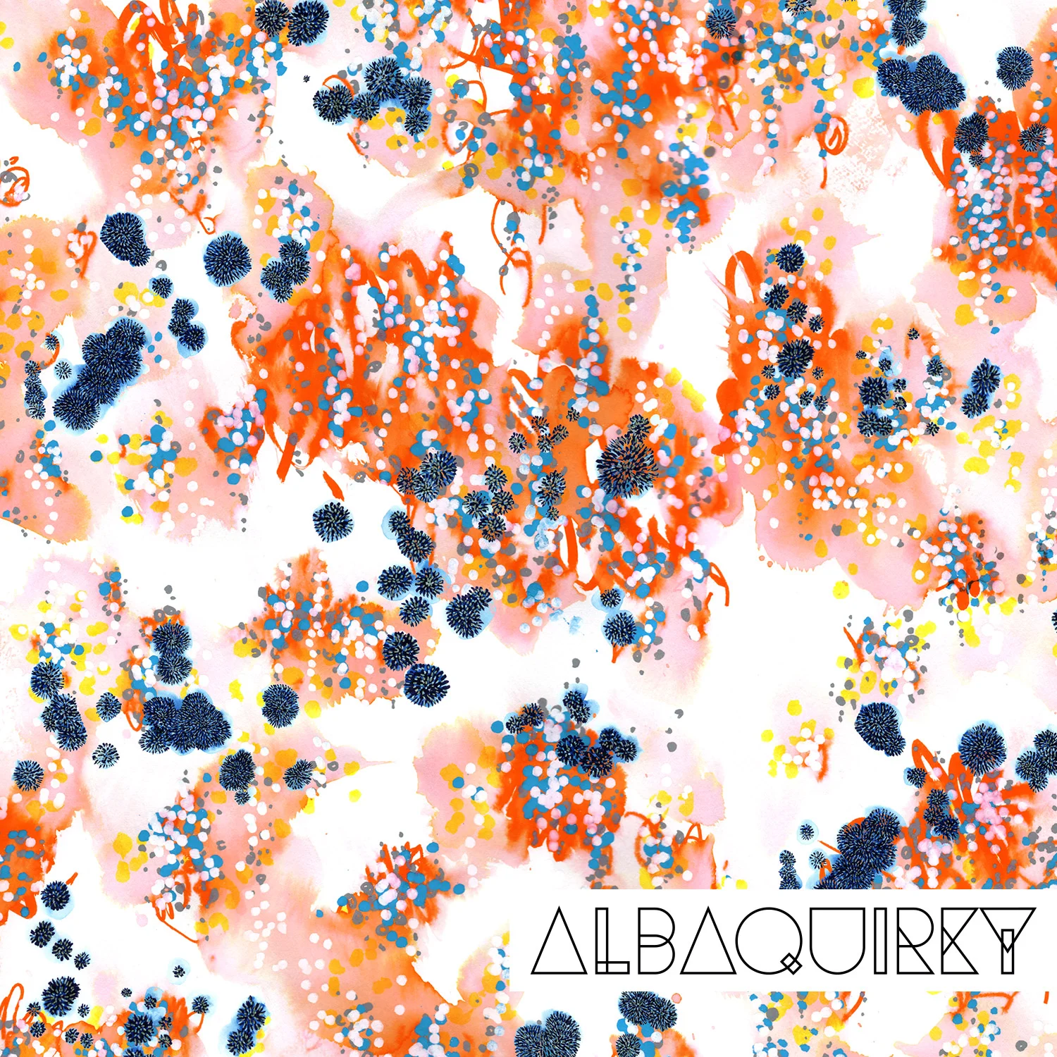
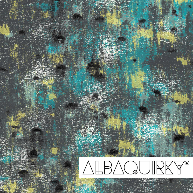
After developing this series of paintings and drawings digitally, they became two designs. A softer green, mossy design and a brighter, bolder design more inspired by the lichen. The bolder design was a logical choice for catching people's eyes as they walked by the booth at Printsource, so I settled on that.
We sent all our banners off to the printers a few days ago, and wait excitedly to see them come back. I hope you can join us at Printsource to see the final designs.
Thank you for reading about my design process!

